


I have chosen to add to most of my fluid media drawings with my ‘counterpoint’ dry media but above are the drawings to which I chose not to add. These drawings were produced just after my morning run through a nature trail and contain many references to the natural world. For the drawing at the top left, I have already discussed how I like its simplicity and this is true of all the images in the top row. For the images on the bottom row, I feel that they are complete and anything added to them would be overdoing it. Therefore, I have chosen to leave these drawings as they are.

When assessing my drawings a few of them looked like woodland undergrowth so it felt natural to add eyes staring out from in between the branches. These eyes could represent creatures living in the trees, bushes and hedges that surround the area where I run and shows the abundance of nature that is all round us, bursting out from everywhere. You never really think about it, but even in the city, you are never really that far away from wild animals. It could also represent a paranoia I feel of being monitored and watched. With our lives so on show through social media and with the current need to track people during the pandemic, few things feel truly private.


Further developing the idea that life, in some form, is all around us I started to add shapes to some of my drawings that look like very basic organisms, like molluscs (as above). This process was more instinctive than deliberate and flowed as a natural development from my previous drawing of eyes. The above image is one of sanctuary and peace and there are themes of nature within it. This reminds me of our connection to nature and all life. Just being around nature and greenery reduces our blood pressure. This fact has become very important to many people at this time, when lockdown challenges our mental health.

Another addition I made to a couple of my drawings was a bumpy pattern on the inside of the some of the looping strokes made. This, I think, is slightly reminiscent of lichen. Obviously I see a lot of lichen on my morning run but it is not something you notice (except here, maybe subconsciously). It is a very successful species and is all around us, yet we do not acknowledge its existence.
I have also added, with my dry media, some fox ears as a tribute to the urban foxes I often see around my run route and in my garden.
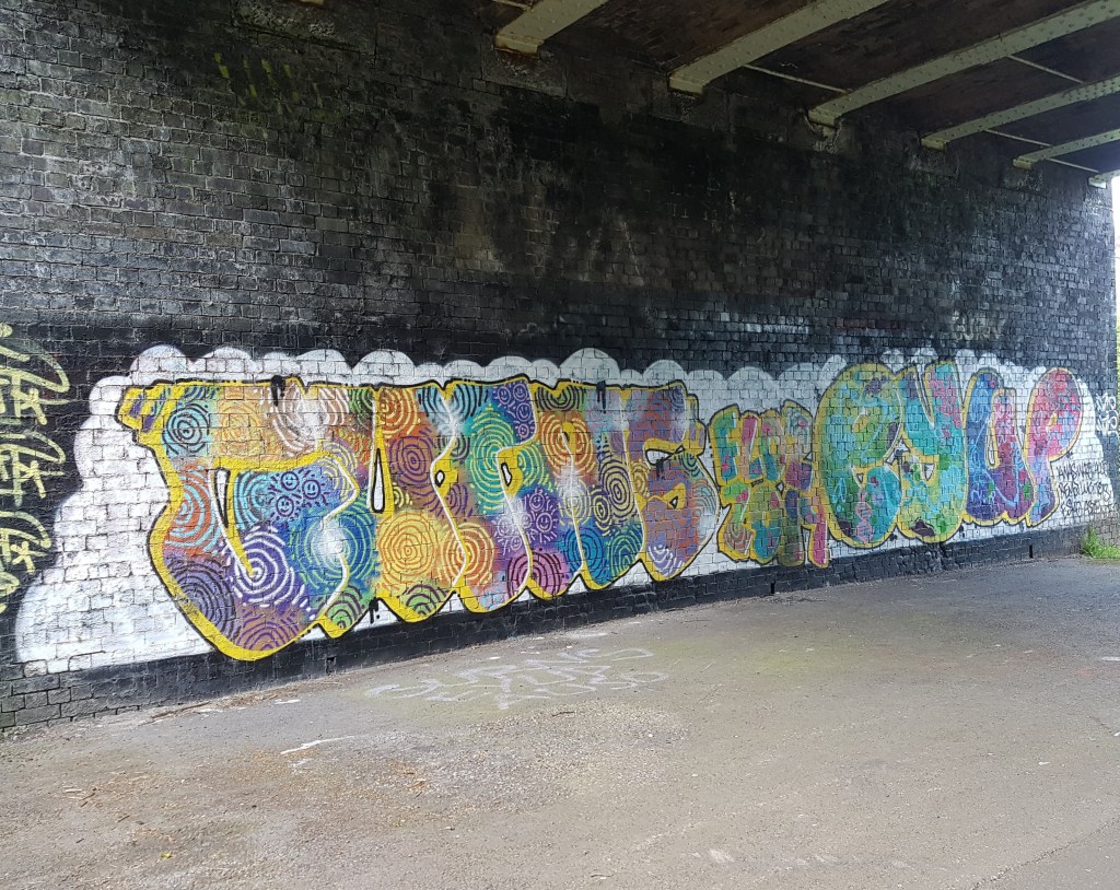
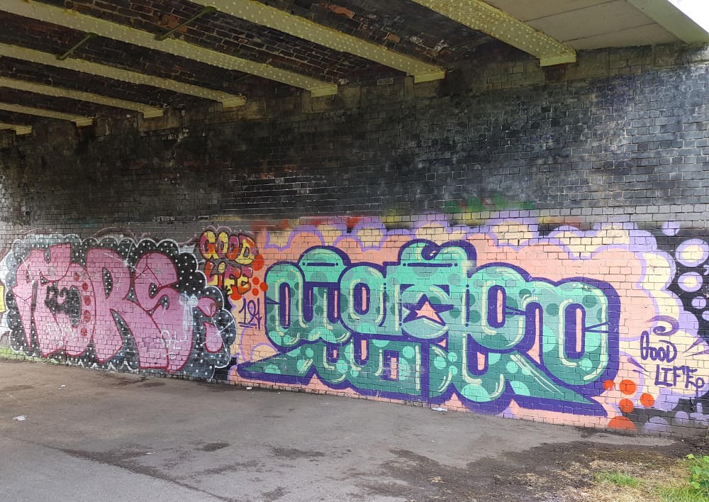
The lichen like pattern could also have been inspired by the graffiti that adorn the walls of the bridges I see on my run. The graffiti artists often fill the lettering they paint with patterns and some are similar to the pattern I have added to the loops of my drawings. I have added a couple of examples of this use of pattern on graffiti below.
As the graffiti I see around me has inspired my fluid drawings so much I thought I would incorporate some of the wording from it in my dry media additions.
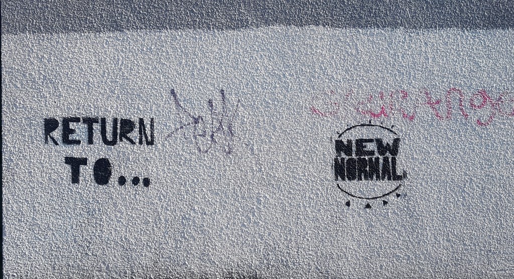
One graffiti artist whose work I see around a lot and like has the tag ‘Good Life’ so I added this to one of the more graffiti inspired drawings. One of the things I like about ‘Good Life’s graffiti is that it looks like writing but I can’t figure out what it says. It looks like another language, some kind of code or maybe just shapes that look like words. This drawing also looks like writing but isn’t, so I thought it appropriate to pair it with a reference to ‘Good Life’. I also thought ‘Good Life’ was an appropriate phrase for one side of my feelings about the pandemic. I say ‘one side of my feelings’ as I am quite ambivalent about the situation; one day I’m enjoying the personal space and reconnecting with nature and the other I feel trap and stressed. This drawing I feel reflects the former. Below are my drawing and two examples of the graffiti that inspired it.


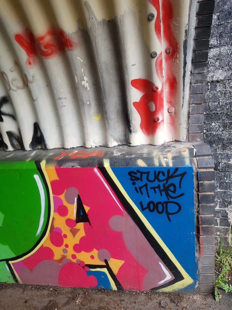
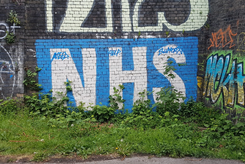
The other side of my feelings about the pandemic may be represented by two more of the drawings with which I included writing. The first is based on the piece of graffiti below, in which the words ‘Stuck in the Loop’ can be seen. This presumably refers to the ‘Fallowfield Loop’ which is the name of a cycle route which is sometimes part of my run route but I felt it was rather poignant. I think this is how many of us are feeling at the moment, stuck. I am a key worker but not on the front line of the pandemic. From the point when my office gave us the facility to work from home I have been in somewhat of a holding pattern; waiting for things to return to normal.
Some of the loop we are stuck in is bad and some is good. In the below picture maybe the good is represented by the references to nature (in the vine like shapes and colour), expressing how I have been able to spend more time amongst it and this has made me appreciate my local area more. The bad is represented by the eyes that are watching, maybe anxiously to see how the situation changes or maybe they are eyes watching how we behave in this situation.

The dry media in the other drawing I refer to above is based on the below piece of stencil graffiti that I noticed early on in lockdown, on the wall of one of the bridges I pass.

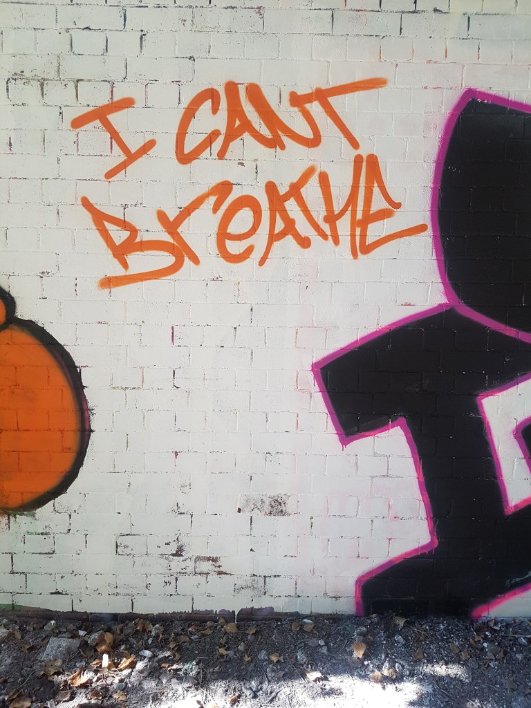
I cannot say definitely whether or not it was there before lockdown or if it indeed refers to the pandemic at all but I see it as a sign of people’s unrest. More of the graffiti that has appeared recently is political in nature and this is also a sign of unrest. I have included some examples below. Maybe most affecting are the words ‘I can’t breath’ which is clearly in reference to the death of George Floyd and the protests that have been seen around the world that highlight the desperate need for change (I did not include this in my drawings as it appeared after they had been completed).


I chose to add the phrase ‘Blood on their hands’ from the aforementioned graffiti to the below drawing in reference to the pandemic and the public strength of feeling that the pandemic has been mismanaged and that this mismanagement has cost lives. I felt the drawing appropriate for this subject as it contains industrial shapes that look like parts of cranes or machinery. This could, in conjunction with the wording, reference the fact that many construction worker were kept working throughout the pandemic despite the rise in infection. This led to criticism that worker’s lives were being put at risk in the name of profits.

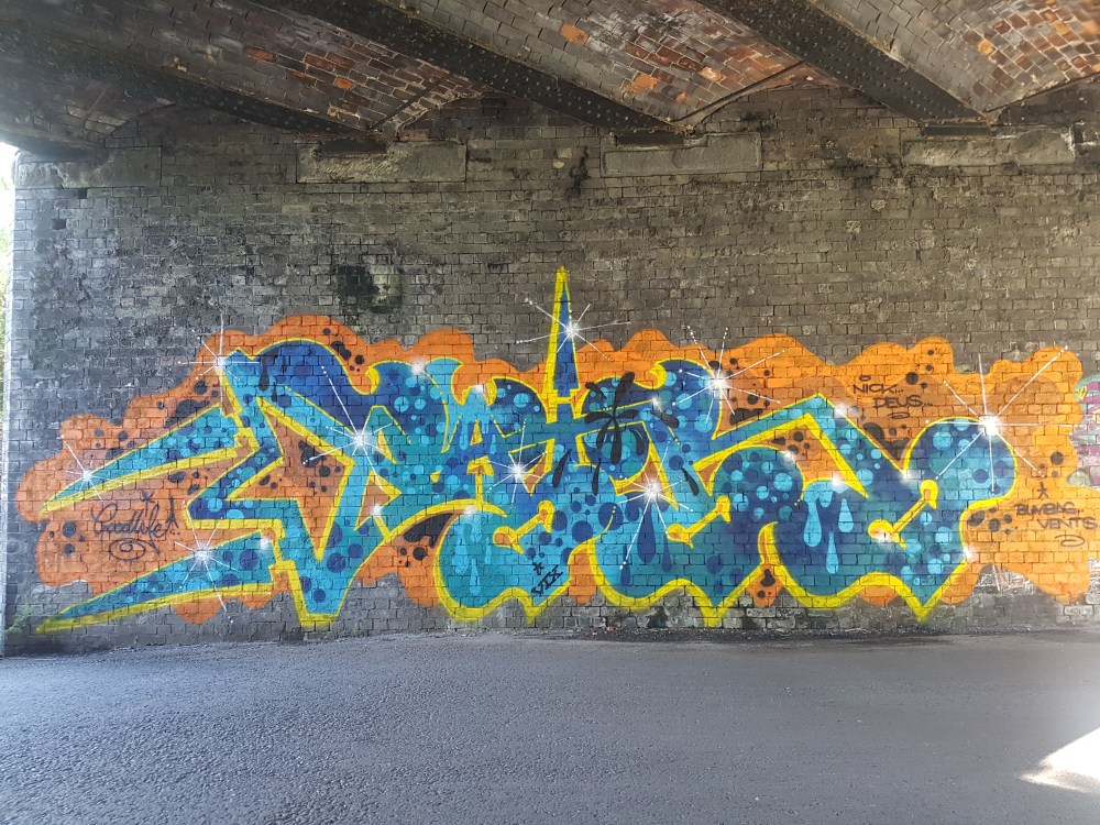
Another image in which I appear to have drawn inspiration from the graffiti around me can be seen below. The words ‘Ring my bell’ are taken from one of my favourite pieces of graffiti (photos of which can also be seen below). Obviously the graffiti is referencing the Anita Ward disco classic and it always makes me smile when I see it. This piece of graffiti is a mile stone to me and signifies that I have run a certain distance which also makes me feel good. I think this piece of graffiti has played on my mind recently because I have started to miss the fun of a night out and with the reference to disco and a painting of a DJ next to it reminds me of this.


I added the squares on the right with my dry media in reference to the brickwork under the graffiti but I like that it looks like a small settlement of houses on an island. This may also be a subconscious reference to things I miss as is reminds me in some ways of Positano in Italy. I got married in Italy and went to Positano for my honeymoon; since then Italy has become an important place to me where I experience joy, freedom and wonderful food. Knowing the hard times that Italy has experienced in recent months makes me concerned for this place that I love and here you can see it may be playing on my mind.
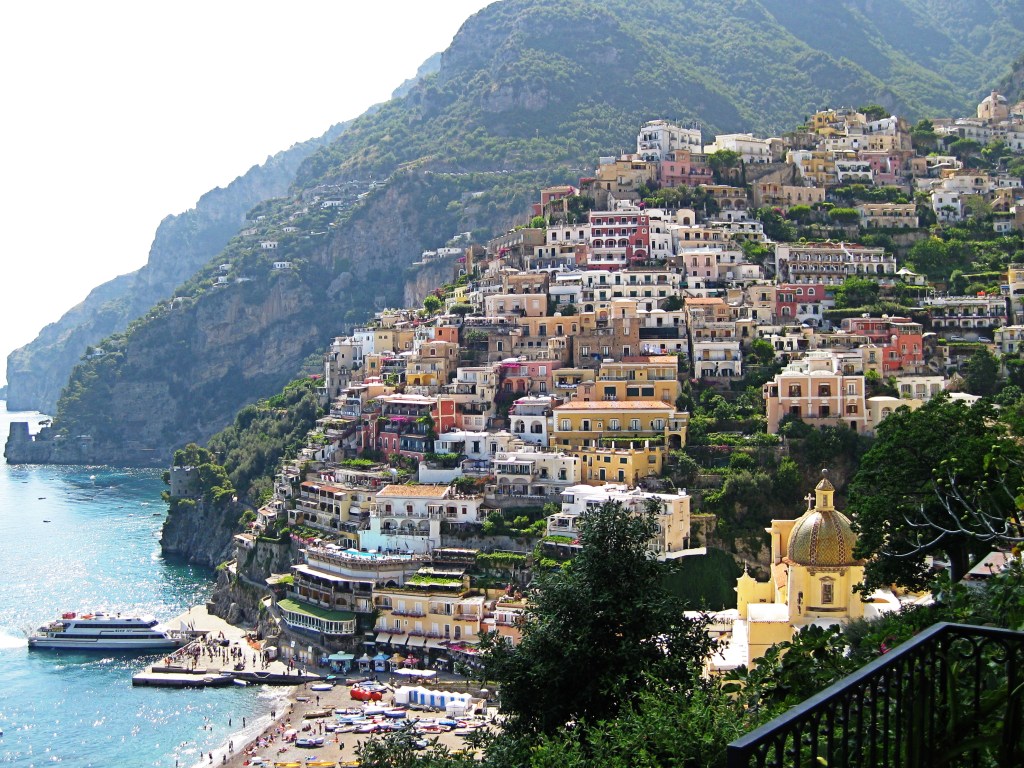
I am please with my additions to the ‘Ring my bell’ drawing and so I decided to add some more settlements of squares to the drawing below. The squares on the right hand side of the drawing look like they are clinging to the side of a cliff much like Positano (see above). This drawing is particularly appropriate for these references to Positano as it looks a bit like a shell and Positano is a seaside town.

Another drawing on which I used wording has a different inspiration. The phrases used on the below drawing reference a song called ‘Hello Earth’ by Kate Bush. I was listening to this during my run on the day I made my fluid drawings and I thought it interesting that this may have influenced the shapes I have drawn here. These circular shapes do look a bit like planets. Kate Bush said about ‘Hello Earth’ that it is a lullaby for the Earth. The song gives the impression of the singer viewing the Earth from a distance and being in awe of the wonder of nature. This is a feeling I share, awe and amazement at the abundance of life on our planet. Earth is the only planet in the solar system with life (that we know of) and it is bursting out from every corner, even in the most unlikely places. These feelings have clearly come out here; maybe partly influenced by the song and partly influences by the nature I was seeing around me. As I said in my previous post the circles also look a little like nests. Nests are home for many creatures and in a wider sense Earth is our nest or home and thus deserves our respect.
Some lyrics from the song that I have used here are ‘I was there at the birth’; this could refer to the birth of the universe or Earth. These events were long before our time and give a sense of our smallness and insignificance. We, as humans, think we are important but we are a tiny part of nature and the Earth’s history. I find it amazing that even trees often vastly out live the life of a human and yet we give ourselves such importance. Many astronauts have said that viewing the Earth from a distance and seeing all of nature at once has filled them with renewed understanding and sense of the preciousness of life and a need to protect the planet. This is called the ‘overview effect’ and it is something I talk about in a previous post about the installation ‘Gaia’ by Luke Jerram. I feel this is something I have tried to express here as these thoughts are something I ponder often when spending time in nature.

The drawing below I started on the left page but as my strokes were flowing in grand gestures I let the drawing spill over on to another page. The strokes initially started out like plants or vines that eventually turned into a swirl on the right. I thought this looked like a beak so I drew an eye in the gap above it. The patterns I have added to this with my dry media have an insect like quality. They could be veins on an insect’s wing or a spider’s web that has been weaved between two branches of a plant. This has been subconsciously created as a tribute to the little creatures (birds, spiders, bees, etc) that surround me on my run.

Lessons to be learned
I am not happy with the dry media I have added to the image below. It started out as the loopy image that can be seen in the second image below. It started out as one of my favourite fluid media drawings and that is partly why I wanted to develop it. I liked that it was clearly inspired by the type of writing that is used in graffiti but I had no particular inspiration or plan as to what dry media to add. In hindsight, that lack of inspiration should have tipped me off to the fact that I actually felt the image was complete. This is a lesson to me that I should listen to my instincts and ask myself why I feel a certain way about a drawing. Not all images need developing and re-developing; some images can stand on their own.


I am also not happy with the image below. However, I was not entirely happy with this image even before I added my dry media. Before I added the dry media I felt that the image was too busy but decided that maybe a ‘more is more’ approach might work. Clearly this was the wrong call and I should have taken a more considered approach. As with the drawing above I did not feel any particular inspiration regarding what dry media to add to it. However, in this case I don’t think it was because I believed it to be complete but because it needed a more careful approach to develop it properly.

Self Assessment
I feel that I have learnt some valuable lessons from this exercise. The main one being to listen to my instincts as to when a piece is finished. Not all the drawings needed dry media to help them express what I wanted them to express. My development of the first drawing I spoke about under the title ‘Lesson to be learned’, I believe was a mistake. Whilst I was very disappointed about this initially, I think that the mistakes I made have been of great value to me as they have helped me learn.
Conversely it was important to develop the ideas that would benefit from development. In many of these drawings I think my dry media additions helped express some of the themes running through the images. I think the first image with dry media that I added to this post is a good example of this. The simple addition of eyes help it to tell a bit more of a story and adds interest. I am also pleased with my use of wording on some of the images as they make the viewer question what they think the image is about and hopefully convey some ideas.
I need to gain the confidence to know when further development of a drawing will help express my ideas and when further develop will bring no benefit.
It is also worth noting that I think I repeat myself a bit in this post and therefore I need to work on being more concise and organising my ideas better.
