In our study material we were told to look at Geraldine Swayne’s website in the folder entitled ‘paintings 1’ and that this folder has many works in it that cross the painting – drawing divide. This folder is not there and the artist appears to have rearranged her website. Therefore, I looked around her website for images I found interesting. I enjoyed seeing how Swayne’s style has evolved over the years. The works I found that kept drawing me back to them were mostly her early works; particularly ‘Paintings 2009-2010’ and ‘Paintings 2010-2012’. I feel that these folders have works that cross the painting – drawing divide so decided to study some of these works further.
Considering the motivation for these works, I don’t believe that these drawings are simply studies for larger paintings. You can see similarities between some of the drawings and some of the oil or acrylic paintings but I think this is because the drawings and paintings influence each other rather than one being a deliberate study for the other. These works may just be part of the same stream of thought.
An example of this can be seen in the works below. I believe that these works share some similar imagery. The main face in both these works has dark, centre-parted hair, a similar nose, mouth, dark eyebrows and shaped face. The main figure is also positioned similarly on the page. There is a tension and darkness to these works. I think this tension is largely due to the sad or fearful expressions on the figures faces and their intense eyes.
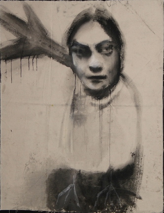

Bottom image: Acrylic on board by Geraldine Swayne (2009) – https://www.geraldineswayne.org/photo_10035448.html [accessed 22/10/2020]
The image at the top is a good example of the crossover between painting and drawing. The medium used here is gouache paint on canvas. Initially I thought this might be charcoal and chalk due to the texture of the lines and shading. The use of paint rather than dry media on this work has added an interesting touch because the paint has dripped in some places and the artist has scratched what looks like birds feed into the paint at the bottom of the figure.
These feet add a surreal quality to the drawing and I’m not sure what they represent. Maybe they don’t represent anything and this work is simply the artist experimenting with technique. This drawing may have been produced in a similar way to the drawings I produced in ‘Exercise 1.1 Experimenting with immediacy and the fluid line’ and to Louis Bourgeois’s insomnia drawings.
There is definitely a surreal and dream-like quality to the drawings in these folders. I believe that Swayne’s intentions for these drawings is simply to explore ideas, thoughts and technique freely. These streams of thoughts may lead to larger works but I do not believe this was the original intention.
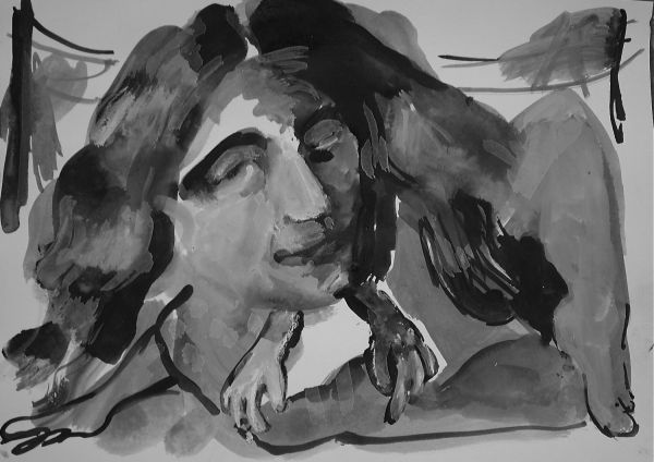
In the second painting the largest figure looks similar to the figure in the work at the top but the expression is more fearful. Both figures in this paintings are looking at something or someone that is out of the frame to the right. Both figures are quite similar looking but there is a contrast in how they are dressed; the larger figure is heavily clothed but the smaller is naked from the waist up. I initially noted in my learning log journal that although the smaller figure clearly has a woman’s body that I thought this may represent a child sitting on the larger figures lap. I thought this signified that the subject matter the artist was dealing with here was child abuse and grooming but I think this is incorrect. I may have been influenced by another piece of work I looked at prior to this one (I discuss this work next). On further viewing I actually think the smaller figure is sitting next to the larger one; nevertheless I think the larger figure looks fearful for and protective of the smaller figure.
The smaller figure is pushing her chest out in a pose that appears to be directed at whoever is to the right. These two figures may represent two sides of the same woman. This may reflect the pressure on women to conform to a certain standard of beauty and cater to the male gaze. Further to this the painting shows the internal conflict that this creates. The smaller figure seems to be posing for whoever is to the right and in this way is showing off and maybe trying to get the viewer’s attention. The larger figure, however, seems fearful of the viewer and reserved.
This may also represent an opinion that society (the media especially) has the tendency to divide women into the two categories of Madonna or whore. Growing up with this judgment around you can be difficult and grows ever more difficult with social media’s bombardment of how to look and behave. Whilst I have said that I don’t think the smaller figure is necessarily a child, the face does look quite young and this feeds into the idea that this may be, in part, about society’s sexualisation of girls in the context of the social media age and the dangers that brings. I feel that this image reflects at least some of these ideas.

The above image is the picture I previously mention that I believe may have influenced my assessment of the painting of the two figure. As with the previous work I initially believe that the drawing centred around the subject matter of child abuse and grooming. This influenced me to judge the painting of the two figures in a similar way, believing that there was a running theme.
The child in the foreground looks scared and worried. She has her back to what looks like a bed containing a couple having sex. I thought that maybe this child had witnessed the scene in the background or the background could represent an act that had been forced on her. There is much sadness and fear in this picture but I now believe my original assessment of the imagery is incorrect.
This work does not have a title on the artist’s website but since saving the image to upload on to my learning blog, I have learnt that the file is entitled ‘TINTORETTOS_DAUGHTER_WEEP’. I was curious about this and did an internet search for ‘Tintoretto’. I discovered that he was a painter in 16th century. His daughter Marietta Robusti was also a talented painter but at the time, convention prevented her from a career as a professional artist. She studied painting under her father, was his assistant and it is said that she produced several alter pieces under her father’s name. Two European monarchs expressed interest in having her as a court painter but her father declined on her behalf so that he could keep her close by. Instead he arrange for her to be married. She died at the age of 30 during child birth.
This knowledge has made me look at the drawing in a different light. This work may not be about child abuse but about the historical expectations placed on women. The child in the foreground may be the young Marietta Robusti, at the age where she has started learning how to be a painter. However, in the background is her future. Her future is to become a wife, have sex and have children. Maybe the young Robusti knows that she will never be allowed a career as a painter and this is why she looks sad and fearful. This is a theme that speaks to me as it is a sad truth that the work of so many female painters has been lost over time due to lack of recognition.
This drawing is well shaded and the use of light and shadow adds to the atmosphere, especially the shading on the girl’s face. The medium is ink and pastel and I think the use of ink is important here as it adds great contrast and this creates more drama. The use of ink and the way this is shaded is reminiscent of an illustration in a story book. This puts the viewer in a child-like mindset. I’m not sure if this is intentional but it helps the viewer see through the child’s confused eyes. This drawing is emotionally effecting and stands as a piece of work in its own right rather than a study for a larger piece.

The above image clearly bridges the painting – drawing divide. The medium (as with the previous drawing) is ink on paper. There is an interesting use of shading in this image but the technique is very different to the previous ink drawing. The shading in the previous image is defined and contrasting whereas the shading here is smudgy and and dream-like. In this drawing there are electricity pylons and blurry shading that might be trees, suggesting that this is a landscape of some kind. However, in the shading on the right it seems like a face is appearing. Again this brings a dream-like quality to Swayne’s work and suggests that these drawings are thoughts passing through the artist’s head that she wishes to document. The face in the background adds tension and paranoia to the drawing.
The limbs of the figure in the foreground seem oversized and distorted. This creates a surreal and disorientating feeling to the image. There may be a dog in the foreground suggesting that the main figure is going for a walk but being watched.
When trying to assess why this image seems more like a drawing despite the use of fluid media; my conclusion is that it is the way the artists uses line and shading. The lines are dark and defined and do not seem to be as blended with the shading as we think of in traditional painting. There is also a free ‘sketchiness’ about this image. In writing terms this would be notes on a subject rather than an essay. This observation is not to take away from its value as a work in its own right as I find this free, raw image making interesting and effecting.
The above image is similar to the previous piece of work in how it bridges the gap between drawing and painting. As before you see the artist’s use of line and shading is similar to that traditionally used in drawing. Again the medium used is ink but with the additional dry media of chalk. The use of monochrome colour adds to sense that this is a drawing not a painting.
I like the use of dry media on this image. This is a nude and the chalk is mostly applied to the face and hair. This makes the image look distorted and blurry as if not real. Maybe the chalk represents make-up the figure has applied or an instagram filter. This could be a reference to the pressure on us all to maintain the high standards of youth and perfection for which society expects us to strive.
As in the image with the pylons, the main figure has distorted looking limbs and in this image appears to have three arms. The title ‘ a sizzler’ suggests that this figure is to be desired and is a beauty, a ‘pin-up’. The use of distortion in the image is juxtaposed to the title. I think the juxtaposition is used to reference the sometimes bizarre and ever-changing standards of beauty we are told we should strive for in order to be considered of value.
Conversely maybe the artist is agreeing with the title; saying that this woman, in her unusualness, is beautiful because she is different. The artist maybe saying that women other than those considered traditionally ‘beautiful’ are to be desired and admired. For this figure, attempts to conform to traditional standards of beauty would ruin what makes them attractive.
Either way I believe the above image is the artist’s thoughts on the objectification of women. I believe there are similar themes in the below image.

OLYMPUS DIGITAL CAMERA
In the above image the main figure lies in the foreground in a very passive pose while the other figure measures her. I would say that the figure in the foreground, to some extent, represents current beauty ideals. She is strikingly blonde, has flushed cheeks and dark eyelids (which implies that she is wearing make-up). I would guess that the background is a studio or bedroom of some kind; maybe the figure is a glamour model. The other figure is measuring her in the way bodies are measured for coffins. I did first think that the figure in the foreground might be dead but I don’t think this is the case. I feel that this measuring is more like they are measuring her beauty; whether she’s up to standard. The figure with the measuring tape is naked and has a woman’s body but quite a neutral face that may in fact be a man’s face.
The artist may be musing on the fact that as women we are often compared to each other and pitted against each other but this is not necessarily what the individuals want. This could be seen as a manipulation from a patriarchal society. The figure who is measuring is not a female friend but a representation of society.
An element of this image that I find interesting is the fact that it bridges the gap between painting and drawing in a different way to the other images. For this drawing the medium is pastel and ink (with pastel being the predominantly used medium) but the shading and lines are used in a different way. I think this is more like the use of shading and line in a traditional painting. The shading and lines are more blended and in this way the artist uses dry media in a way that fluid media is more traditionally used. I feel that this shows the artist’s versatility and the free experimentation that is present in this collection of works.


Bottom image: Sketch of ‘A saucy starlet’ from learning log book
The above image (see top image for original) entitled ‘A saucy starlet’ is made with ink and chalk as in the image entitled ‘A sizzler’ and I believe the subject matter may also be similar. The top image is the original version of the image and the image below is a sketch I did of the image in my learning log book. I have included both images in this post as although I sketched the image to help me further understand the artists technique and choice of imagery, I also believe the medium used is an important element of this work.
The title ‘A Saucy Starlet’ helps us begin to understand the subject matter this image is discussing. The figure in the drawing is clearly supposed to be a nude however the body and face are very flat. The ‘breasts’ are the most noticeable and prominent part of this figure and I believe that this is intentional. They stick up like rocks or scones in an almost comical way. There are three spheres running down the centre of the torso and although the figure may be a nude this might actually be buttons on a piece of underwear. I think they look a little like pom pom buttons on a clown’s shirt and this adds to the comical nature of this image. Her hair is wavy in a 1940s Hollywood style, adding to the image that she is a ‘starlet’.
None of the parts of this figure look very human except for the eyes which have a sadness to them. The parts of this figure seem like inanimate objects and this may be the point of the image. This ‘saucy starlet’ is just an object to the viewer. She has become so much of a sex object in the viewer’s eyes that she doesn’t even really have a proper form. It is almost like she has melted into whatever it is she is lying on and become an object herself. This image is about the objectification of women.
The expression in her eyes is sad but in a resigned way (as if she has resigned herself to her fate). She is inanimate, unable to move and trapped. This could be illustrating the trap that actresses and models can find themselves in. The pressure to be seen as desirable is the trap because that can be all you become to the viewer; a desirable object. Whilst the blame for this is lies not with the ‘starlet’, they are the one that ultimately suffers. This is obviously not the view of all viewers but maybe how society views women and their ‘worth’.
The slightly whimsical title and some of the comical imagery is juxtaposed to the image of this trapped figure and this makes the image slightly sinister. This whimsy is also the artist revealing the ridiculousness of society’s objectification of women and idea that women are merely decoration and not to have inner worlds, opinions of their own or depth (literally in this case).
The running theme in these images is experimentation and free flowing ideas. These images are notes and the artist’s motivation is merely picking apart topics that interest her and expressing her running thoughts. There is sometimes a contrast between slightly whimsical imagery or titles and dark subject matter and I think this makes a big impact on the viewer. Another purpose is experimenting with technique and how different techniques can convey an idea differently. You can see a variety of this across all the folders.
Self Assessment
On first viewing of Geraldine Swayne’s website I must admit the bulk of her work didn’t really capture my attention. I now believe this was naive of me as on further investigation and analysis there are quite a few works I find interesting and effecting. This is a reminder not to simply dismiss work at a cursory glance and that further analysis can help you understand and enjoy the work more.
Of particular interest were the ink and chalk drawings that I discuss latterly in my post. I feel that the imagery used in these drawings are a little mysterious and the meaning behind them is not always obvious. This encourages the viewer to think more deeply about them. I don’t necessarily think this was the artist’s intention but just a natural consequence of such experimental work. This meant that I thought in more depth about the drawings and I think for the most part understood the general meaning and motivation behind them.
I believe that I did make some errors of judgment during my analysis of these drawings. There are some difficult subjects and feelings expressed in these drawings and paintings. I appreciate that due to the complexity of works such as this, I may not always understand the meaning behind them or the intent but that is part of the learning process and I will always strive for further understanding.
In particular I initially misunderstood the ink drawing of the girl in the foreground with a bed in the background and the painting of the two female figures. I originally thought the subject matter for both these images was child abuse but I now believe that this is not the case. I believe they are more about society’s view and manipulation of girls and women to follow a prescribed path or be a certain way. The thing that made me change my opinion was really looking in great detail at each work and considering why the artist painted or drew each figure in the way she did.
I was also tipped off that my assessment of the ink drawing of the girl was incorrect because of the mysterious name of the image file. This led me to research the name ‘Tinoretto’ and this opened up a whole new path of analysis. This shows that sometimes you need a base of knowledge to understand a work but if you do not already have that, a bit of research can fix it.
The drawing I did of ‘A saucy starlet’ was, as always, a useful method of analysing the image and investigating it further. However, I do not believe that it is a particularly good representation of the work. Despite the change in medium I think I did well with the shading on the figure but the expression on the face is not quite right. The expression in the original version is more passive and sad than in my sketch and the face is also flatter in the original. Nevertheless, it was a useful process and a lesson that not all drawing is about the finished product and I believe this philosophy is represented in Swayne’s works also.
One of the most useful parts of this exercise has been looking at the cross over between painting and drawing and how this mixing of technique can be used to effectively convey ideas and emotion. I have been particularly inspired by Swayne’s use of ink and gouache. These are mediums that are relatively new to me and I am interested in the way they have been used to shade. They have both been used in a variety of ways and this shows that as an artist you should not be bound by convention in the way you use your medium.
Additionally, I have noticed that I use the word ‘maybe’ quite a lot when expressing my analysis of the meaning behind things. I think this is a confidence thing and shows I have some way to grow regarding confidence in my ideas.
