

Bottom image: Dry media drawing using pencil ‘Wall of Boxes’
In this exercise we were asked to do two drawings of the same subject. One drawing to be done in fluid media, adding tone and shading first, then draw an observational drawing in dry media over the top. The second was to draw an observational drawing only in dry media. The results are the two drawings above.
The exercise said to choose a subject matter ‘that has visual interest and a simple variety of tones’. I don’t think my choice of subject matter actually has either but I chose the subject due to its illustration of my current state. This is the view I see everyday from my desk. It is a stack of boxes and art materials that my husband and I call ‘the wall of boxes’. It sits next to my desk which is a place where I spend most of my time. This is where I study and where I work in my day job (since lockdown). I currently live in temporary accommodation because I am waiting to move into a house that I am trying to buy and thus I have never fully unpacked. The flat I live in is small and there is stuff everywhere; ‘the wall of boxes’ is the epicentre of the clutter. However, this is not a complaint – I was unhappy in my previous flat and therefore am relieved to be somewhere new.
I was originally going to draw the pretty view of trees that I can see from the window near my desk but I did not feel this was representative of my current world. I feel that the lovely view outside is always somewhat in conflict with the view inside. However, as I said, this is not a complaint because to me ‘the wall of boxes’ not only represents the tiresome impermanence of my situation but also the hope of new beginnings. I am all packed and ready to go.

I decided to use gouache as my fluid media in my first drawing because I felt inspired by Geraldine Swayne’s use of it during my previous contextual study. It is a paint I have seldom used and normally in small quantities so I was curious as to the effect it would create. Initially I found it difficult to get the tones right. I found that watering down the black gouache paint to make grey and mixing the black and white gouache to make grey created very different effects. There may be some blue tones in the white paint because the grey using a mix of black and white had a blue tint to it. This initially created some inconsistencies in the shading (as seen below).

Initially I found this frustrating but on reflection I quite like the different tones this has created. It gives a sense of varying light and makes it a bit more interesting.
Painting the tones and shading first has created an unevenness in this drawing. As there were no outlines to guide the overall shape of what I was shading inevitably some of the shading spilled outside the shapes normal boarders so when the observational drawing was drawn on top, this created an uneven look. I like this unevenness. I think the contrast and wonkiness of the fluid media drawing conveys the sense of clutter and the haphazardness of living out of boxes well.
Another effect of using this type of paint is that you can see the specific brush strokes made. The texture of the paint doesn’t really lend itself to big sweeping gestures. Maybe this is because it dries quite quickly or maybe it has a high viscosity. Either way, the paint insists that you use small strokes. This helps convey a sense of clutter in the subject matter but also adds character to it and a sense of natural light. This helps you feel that this subject matter is not entirely negative. It’s the drawing at the start of a journey.
I think there is more detail in the subject matter I chose than the exercise intended. However, I am still pleased that I chose this subject matter because I think the gouache helps represent the light and shadow of these items quite well.
When comparing the methods used in the two drawings, something that I feel has had a big impact on the result is the light that is cast at certain times of day in this area of the room. In the first image (the fluid media drawing) the method was quicker and the drawing was created over the course of a bright, sunny afternoon and I think you get a sense of that from the shadows painted. The second image (the pencil drawing) took much longer and was drawn over three mornings. This made the shading more difficult due to the variation in light on the different days. The first morning was bright and sunny, the second was overcast and dark and the third was sunny again. I think this makes some of the shading inconsistent.
I feel that the pencil drawing is the more accurate drawing despite some of the perspective being a bit off. However, I think the time spent accurately shading has made it look flatter and more unemotional. It is a softer, gentler version of the view than the fluid media drawing but I don’t think it quite conveys the sense of clutter as well. This may be because there is less contrast and the shading and colour is smoother and more gradual.
The fluid media drawing ended up bunched in the left hand side of the page. I think this is because I was concentrating so much on the shading, I wasn’t really concentrating on where I was placing the image. I will probably crop this though. The pencil drawing is also off to the left a bit but this is actually how the view from my desk looks.


Right hand side: Plant detail from pencil drawing
The pencil drawing is more detailed and I feel that this works well for the drawing of the plant. Whilst overall I prefer the fluid media drawing, when comparing this detail in both my drawings (see above) I think the pencil drawing plant is the better version and I am quite proud of my shading on the pot. Maybe the pencil works well for this part of the drawing because plants are a calming influence so the gentler version of the drawing is more appropriate.
In reality there is writing on the boxes but I have left this out of both drawings. This is partly because I thought it might detract from the main image but also because I am not very good at writing neatly. A lack of skill is not a good reason and I should not shy away from my weaknesses because this means that they will always remain weaknesses. I think I should have added the writing to the pencil drawing because the aim of that was accuracy.
Below you can see the same section of the subject matter from both drawings. This is a representation of a little sketch of a fox I drew. The sketch is now stuck in my sketchbook. I think the comparison of these two images sums up the appeal of the fluid media drawing. I prefer the fluid media version of this part of the image, even though it is more simplified because it is a representation of the fox drawing rather than an attempt to make a tiny replica of it. The fluid media drawing is also more of a representation of the view from my desk and the feelings around it than an attempt to copy the visuals accurately. This is at the heart of this exercise.


Right hand side: Fox drawing detail from pencil drawing
This is a very important point and vital to drawing practice as a whole. Cheesy though it sounds, drawing is partly about representing truth. To consider this further – when you view something in real life the view is not just a flat image to you. There are a number of factors at play. There is light, sound, smell, temperature, feeling (maybe a breeze) and these are all portrayed to you by your own personal senses. These senses will change how you experience things too; maybe your eyesight isn’t great, maybe you feel cold from having been outside. All these things will influence you. Then there is you and how you feel emotionally about the subject or generally at that particular time (maybe you are distracted or tense). All these factors are important to your drawing as well as the purely visual elements and when you create a drawing you are showing the subject through your eyes and how you experience it. This is the value of the fluid media drawing even though it is not entirely accurate as it can become a more rounded representation of your subject.
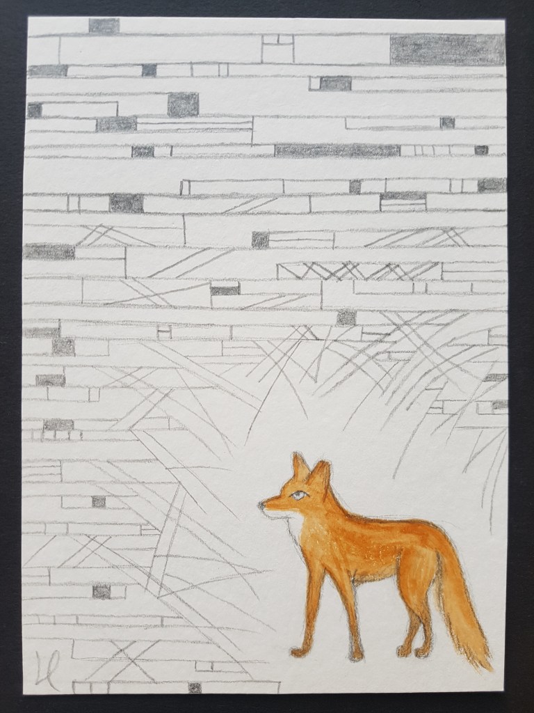
The above image is the original version of the fox drawing that was sat on the wall of boxes. This little drawing is part of a general obsession that I have with the urban foxes that live around South Manchester. I love the thought that even in the city there is nature all around you. At the flat where I previously lived, which I hated, a family of foxes used to visit the communal garden on a near daily basis. The visit from the foxes was something that cheered me up and made my day more bearable. I was quite sad to leave them. The house I am hopefully buying is in the same area as that flat and I am looking forward to seeing foxes in my garden again. This drawing being part of ‘the wall of boxes’ is quite apt as, in a way, it represents the hope of a new start in a new home. The drawing was not placed here intentionally. It was just a happy accident.
Another happy accident is the inclusion of the art materials that are stacked up on top of the boxes. They are up there because I don’t currently have an art space to work in due to the generally limited space I have (again I am not complaining as I know that I am much luckier than some). In the new house I will have a separate room to work in and this is the thing that I am most excited about with regards to my potential move. Therefore, I feel (like the fox drawing) these art materials represent my hope of moving and the potential enjoyment these art materials contain, waiting to be released.
Self Assessment
I entered into this exercise not particularly excited about it. I was keen to finish it and get on to the next exercise. I was absolutely wrong in my initial feelings towards it. This exercise has really opened my eyes to a core principle of drawing (and fine art in general) – why an expressive drawing is of such great value above its accurate portrayal of the visual involved.
I always knew that the way you expressed a subject through drawing was very important but I have never really taken the time to unpick why that is and put it into words. This has been incredibly beneficial and has expanded my understanding. The idea that you are expressing all the elements of the view you are experiencing, I’m sure will influence my work going forward.
This is definitely a lesson to me that I must always engage fully with each exercise as you never know where the exercise will lead you.
Another thing that this exercise conveyed to me is the importance of your choice of medium. This is key to your success in portraying your subject. Time and the way the medium you have chosen speeds up or slows down the process (eg. the type of strokes that work best with it, how fast it dries) are big factors. Representing the shapes well when drawing your subject and accurate observation are both undoubtedly important parts of drawing. However, making the fluid media drawing a different way round to how I usually work (shading before outlines) forced me to focus on different elements of my subject. It made me focus on elements such as light and shadow but also more on the relationship between things (largely from a contrast perspective). I think this change has given me a more rounded perspective of my subject. Not having to occupy myself with the meticulousness of shading with pencil also gave me the freedom to express that rounded perspective.
An element of this exercise that I particularly enjoyed was how the relationship between the painting/shading and pencil/outline was changed by the reversing of the process. Not drawing the outline first meant that the shading was not constrained to a boundary and so some of the shading spills outside its outline. This gives the fluid media drawing a haphazard flow. This also gave me the opportunity to choose only to draw the outline of certain parts of the image. I am pleased with this choice as I think it helps some of the shading stand out and gives the image a sense of depth and contrast.
The choice to use a paint I am not very practised in was a gamble that I think paid off, both from a visual perspective and a learning perspective. Initially I struggled with the texture of the paint as I am used to the flow of acrylic paint which lends itself more to big gestures. You can see that I had difficulty initially from the shading on the left hand side as it is fairly uneven. However, I think I got used to the paint fairly quickly and enjoyed using it. I will use gouache again but think it would be interesting to explore a wider use of colour with gouache next time.
Whilst I think I did a reasonable job of most of the observational pencil drawing; I am not happy with some of the perspective in it (mostly in the boxes at the bottom left hand side). I also think I could have done a better job of the little reproduction of the fox drawing. Observational still life drawing is definitely not my strong point but this exercise is a reminder that it is important to regularly practice this type of drawing as it improves your overall observational abilities. I am, however, pleased with the plant I drew.
Although my choice of subject may seem dull to some viewers and it probably wasn’t the type of image that was stated in the exercise brief, I am pleased that I picked it. I think it conveyed my state of mind accurately and as it is a view I see everyday it was interesting to really look at it and observe details that I hadn’t acknowledged before.
I am glad that I made the effort to properly engage with this exercise despite my initial lack of enthusiasm as it has been bit of a revelation and has helped me grow. I feel I have a bit more understanding of my own work and how the materials and method I use can enhance how I express and convey ideas.
