Franz Kline is an artist of which I was previously aware but through this research I realise that my previous knowledge had really only scratched the surface. I was aware of the following:
- Kline painted large, industrial looking paintings
- worked mostly in black and white
- lived in New York
- was an abstract expressionist
I had also attended a talk at Tate Liverpool by one of their members staff about the painting ‘Meryon’. I found this talk very interesting but as this was some time ago I have, unfortunately, forgotten most of it. I remember that the painting symbolises a specific bridge and that Kline mostly uses house paint and house painting brushes in his work.
General Notes on Franz Kline
Kline used stark tonal contrast and variations of scale to explore gestural movement in his Abstract Expressionist paintings.
Franz Kline | Gagosian
I think the above quote from the Gagosian’s website is a great starting point when trying to understand Franz Kline’s work. His work is about contrast, movement and scale. Working in New York in 1930s, his work reflects the city at a time of great development. He was influenced by the early work of his friend Willem de Kooning. His work rejected convention in both style and the way it was produced, moving away from figurative representation to a more abstract language. Kline would often work at night under harsh lighting to bring out tonal play between black and white.
Kline was part of a group of artists called the ‘New York School’. This group comprised of:
- Willem De Kooning
- Jackson Pollock
- Robert Motherwell
- John Ferren
- Lee Krasner
- local New York poets, dancers and musicians
Kline used paint to create different textures and show the gestures he made. He worked mostly in black and white; creating bold, emotional, dramatic paintings. These are often termed as ‘action paintings’ and are very much about movement and the act of painting. The marks he makes are a record of his movements. His process is almost like a dance, as the movements of the artist are recorded in time and space on the canvas. Kline’s grand, dramatic gestures can clearly be seen in the below painting.

The above painting entitled ‘Le Gros’, which roughly translates from French as ‘the large’ is a great example of Kline’s use of scale. It is almost the size of a person and would have required great physical effort to paint. This painting to me looks like a piece of scaffolding or an iron girder and represents the ever growing industrial landscape he lived in.
Notes on Youtube videos: ‘How to paint like Franz Kline – with Corey D’Augustine’ and ‘From the Curator: Franz Kline’
The video starts with a story about how a gallerist tried to trick Franz Kline into using expensive, fine art oil paint rather than the cheap house paint he loved to use (in a bid to make his paintings worth more). Kline rejected this attempt, binned the expensive paint and bought more house paint.
The question is posed; why did he love house paint so much? In part because it was nearly the opposite of the fine art paint. It was:
- cheap
- crass
- consumerist
- very fluid
- dries hard
- dries flat
- high gloss
- low viscosity (this means you can apply a lot fast)
I can understand that this would be the right paint for this type of work. You can work energetically with it and apply it to the canvas in vast quantities. It is for painting walls so its purpose is to be applied in vast quantities.
THE BIG MOMENT:
One day Franz Kline went to see his friend, Willem De Kooning, who showed him a projector he had bought. Kline used the projector to enlarge a drawing of a chair he had created on a page of a phonebook. Enlarging the drawing abstracted it so that you could no longer distinguish the chair or the numbers from the phonebook.
This moment became the basis for Kline’s abstract language. Before this moment most of his work was figurative.
The above video is interesting when researching Kline because it talks a lot about the use of scale in his paintings. The curator talks about how ‘American’ Kline’s work is in that it expresses ‘the bravado of the new’. This is partly achieved with scale. The abstract expressionists thought that the elegant qualities of traditional European art should be replaced by a rawness and brutality (of the new world).
Some of Kline’s paintings were so big that they had to be painted on the floor. These huge works (many bigger than the human arm span) required the use of the whole body to paint and the brush strokes used are forceful. This meant that the painting was not dominated by the painter or viewer but the painting was the thing dominating.
Kline’s paintings give a suggestion of the important technologies in use in America in the 19th Century; bridges, railroads, etc.
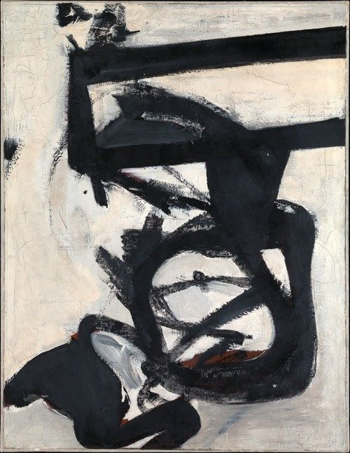
Chief

The above work entitled ‘Chief’ was painted two years after the projector moment and shows his new abstract language.
This painting looks like it was created spontaneously but it wasn’t. It is the result of careful studies. When planning a painting, Kline made a series of abstract sketches that he then transferred onto large paintings using fast gestures with drippy enamel paint.
It is important to note that this painting is not just black on white but it is black on white on black on white. He also used different shades of white. There are several layers of paint creating a ‘giving and going’ between the two colours (a balance).
People sometimes think I take a white canvas and paint a black sign on it, but this is not true. I paint the white as well as the black, and the white is just as important.
Franz Kline
My Opinion of ‘Chief’
Although definitely an abstract action painting, ‘Chief’ has a more planned or deliberate feel than many of Kline’s works. There are more rounded shapes than usual and some parts look like they are coloured in or shaded.
As with many abstract images your brain can’t help but find familiar forms in the shapes and here I see the shape of an animal’s head. This image is less architectural than we usually see from Kline but some strokes look machine-like. For example I believe that the section to the bottom right looks like there are cords or electrical cables dangling from it.
If we imagine this action painting as a dance, I believe it would be a joyful, flowing dance. I believe there is happiness and caring in this painting. There is rhythm to this painting and I imagine the strokes to be of varying speeds.
I like the use of layers in this painting because you can see some of the black layers coming through the white layers. This gives the painting a history and shows the care and time this canvas has been given. As Kline says himself in the quote above, in this painting the white is as important as the black and we should take note of the spaces the white fills and the balance between the two colours.
The title ‘Chief’ represents strength, wisdom and achievement. This is clearly a thing to be admired and something that the artist himself admires.
Notes about Chief from the MOMA website
The MOMA website says that ‘Chief’ was the name of a locomotive that Kline remembered from his childhood when he loved the railway. I can see that this painting is linked to a fond memory. MOMA observes that many viewers see machinery in Kline’s work.
MOMA observes that ‘Chief’ is an uneven framework of horizontals and verticals, broken by loops and curves. There is speed and power in this work as some of the lines rush off the edge of the canvas.
Franz Kline and the influence of calligraphy
There is some conflicting information regarding the influence of calligraphy on Kline’s work, with the Tate website saying “Kline’s sense of space and insistence on flatness were particularly influenced by Japanese art and many of his works have a calligraphic feel.” However, many sources observe that Kline repeatedly denied that calligraphy was an influence on his work.
After further research on the subject of Kline’s calligraphic influences, I understand the below facts to be the reasons behind the conflicting information I found:
- In the early 1950s Kline corresponded with a group of Japanese Avant-garde calligraphers called ‘Bokujinkai’ and studied their work with enthusiasm.
- The post-war environment that Kline occupied leaned strongly towards ‘art nationalism’ and pressured artists to identify strongly with their country of origin. This was true in both America and Japan.
- In the late 1950s due to increasing pressure from influential art critics, Kline started to deny the influence of Japanese calligraphy on his work, despite previous evidence to the contrary.
- Abstract Expressionism seems to have captured the bold, larger-than-life, pioneering spirit of post-war America and was a matter of national pride. Therefore, I can imagine that, at the time, to suggest that there was any foreign influence on it, would have been considered unpatriotic and would have left Kline open to criticism.
- In the mid 1950s Kline moved away from calligraphic looking images and sometimes reintroduced colour and figuration.
- In the late 1950s Kline was well established in the minds of critics as an original American artist and therefore had the freedom to return to more calligraphic looking images (as can be seen in the work below – produced in 1960-1).
Meryon
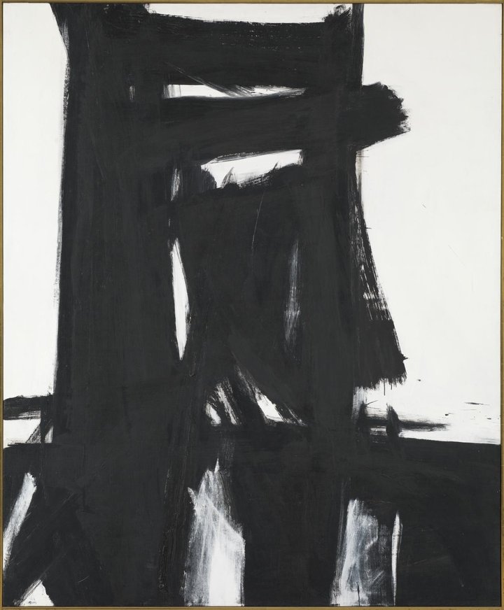
Meryon 1960-1 Franz Kline 1910-1962 Purchased 1967 http://www.tate.org.uk/art/work/T00926
As mentioned in my opening comments I saw a talk about this piece of work prior to this exercise.
You can see in this image the possible influence of Japanese calligraphy because the main shape bears a resemblance to a Japanese character.
The Tate website says ”Meryon’ comprises an unresolved tension between politically motivated art and historical interpretations… This tension forms the cognitive appeal of Kline’s large black and white works, infusing Meryon’s bold brushwork with the reverberations of a transatlantic and transpacific artistic rivalry.’
I find it interesting that this grand, almost boastful painting harbours a tense background. I think you can sense a tension in this painting as the main shape is dominant and imposing.
When observing this piece of work I think it is likely that a lot of people would identify a bridge as the main shape. Whilst Kline did not set out necessarily to draw figurative shapes, he also did not feel that his work had to be ‘completely non-associative as far as figure is concerned’ (to quote Kline himself). Thus, he did not mind if people recognised shapes in his work.
It is interesting to see that whilst Kline does not set out with a plan to draw specific, recognisable shapes, maybe his subconscious has a hand in creating familiar forms.
The Title
Kline took the titles of his work very seriously and sometimes held naming sessions with his friends. ‘Meryon’, the title (according to the Tate website) appears to be a pun.
- Charles Meryon was a 19th century printmaker, renowned for his moody etchings of Paris. He was passionately opposed to the renovation of Paris he saw from 1850 onwards.
- Merion was an uppercrust town in Pennsylvania (just 2 hours drive from Kline’s humble birth place but worlds apart).
This painting could be seen as a painting of the bridge leading from the rest of the Pennsylvania to Merion, a very different upper class suburb. Merion had been depicted in popular culture as a pretty home to a wealthy, upper class society that seemed to belong to another time and place. Often films set in Merion portrayed conflict between the working class and upper class. Merion would have been a well established symbol in the minds of Americans at that time.
‘Meryon’ could represent the suburbanisation of America and may have class connotations. Merion, as a commuter suburb, was a place where commuters would escape the noisy, dirty city that brought them their fortune. This city is where the working class lived. It is worth noting that many abstract expressionists retreated to the suburbs but Kline resisted.
‘Meryon’s’ use of Kline’s signature black and white, which is usually his way of picturing urban and industrial America, here seems contradictory in an elite suburban context. This creates conflict. Maybe this is the conflict of the American dream with the social inequalities of the time.
Whilst Merion represented the rich industrialist’s escape from the city, Charles Meryon’s opposition to the renovation of Paris represents a failed attempt to rescue a city from industrialists. Both these subjects are at play here and this is the root of the pun Kline makes.
Charles Meryon saw old Paris, full of dark, narrow streets where the poorer class lived being destroyed on the orders of the President to make way for large, modern boulevards of building blocks. The old streets were full of pollution, disease, poverty and unrest but these new developments created light and air and were for the wealthy.
The Tate website postulates that ‘Meryon’, in part, represents Charles Meryon’s body of work in that the composition is very like many of Charles Meryon’s prints which contained flat ground with tall, imposing towers much like the shapes seen here. I think this is a reasonable assumption given the title.
My opinion of ‘Meryon’
I think whilst ‘Meryon’ does look somewhat calligraphic, this is probably unintentional and Kline may have been subconsciously influenced by his previous study of the Bokujinkai.
The title is obviously strongly significant and knowing it means that you view the painting differently. Its link to Merion, the town, is key. The inhabitants of this town made their money in the city but do not consider the city good enough for them to live in. The working class live and work in the city and maybe much of the industrialist’s money is made off the hard work and exploitation of the working class. However, these workers would not be welcome in Merion. These two worlds are separate. This is why I think ‘Meryon’ is at least in part about class inequality.
Scale is used to great effect in this painting. The two dashes of paint at the bottom right hand side look like people. They are dwarfed by the great size of the main structure. This structure is both grand and intimidating.
I do think the main shape looks like a bridge. Bridges are a passage from one place to another. The structure of this bridge is industrial looking and imposing. I feel that it’s not just a bridge but also a gateway (maybe a gateway that few may pass). This gate guards the upper class from the rest of the world and maintains their bubble of nonreality. This bridge/gate appears intimidating and possibly insurmountable and therefore may be a reference to a lack of social mobility in America. It implies that the American Dream is not so achievable as one might be led to believe.
I think the reason for the use of Charles Meryon’s name in the title is due to the fact that he too saw class inequality in his city. He saw old Paris, that housed the working class, demolished; presumably this made many people homeless.
King Oliver
I paint not the things I see but the feelings they arouse in me.
Franz Kline

I feel that ‘King Oliver’ (shown above) embodies the above quote by Franz Kline. I discovered this painting through a video on YouTube that was posted by Christie’s, the auction house. I have added the video below. This piece derives its name from an influential jazz cornet player called King Oliver and through this title we can see that this piece is inspired by Kline’s love of jazz and the New York jazz scene. This painting is unusual because of Kline’s use of colour. However, this was during a period where he did experiment a bit with colour.
The below video is interesting and led me to discover this piece of work but I am cautious to note that this painting was being sold on this auction site. The video is an advert for it and therefore not impartial.
My opinion of ‘King Oliver’
‘King Oliver’ is an unusual example of Kline’s work in the use of colour and this somehow makes it look busier than many of his other works. However, I do feel that it is not unusual in its intent as this is undeniably an ‘action painting’. Many sources talk of Kline recording the gestures he makes on the canvas and imagine him dancing in front of the canvas and this is clearly true of this painting. This is a joyful dance, inspired by the feelings that music evokes in us and the innate human need to dance when you hear music.
The way music speaks to us on a primal level is present here and because of this energy and feeling of spontaneity it is hard to imagine Kline creating small studies in ink for this canvas as he did with many of his works.
This painting appears to have several layers, there is a wide variety of brush stroke used and a variety of colours. This makes me think of a jazz band’s many musician and jazz’s busy, sometimes chaotic sound. It also reminds me of the busy city in which the jazz clubs lived. In this sense I think the colours used are very effective. The colours are not subtle or compromising but then again, neither is jazz.
This painting is not figurative at all but I can imagine that the dark lines to the left are the boundaries of a stage or dance floor and the bright colours could be the bright clothes of the musicians or dancers.
Nijinsky
I discovered the above painting on the Met Museum website (www.metmuseum.org/art/collection/search/490194). It is one of Kline’s earliest works to be produced in his signature, black and white style and was included in his first ‘one man show’. The title refers to Nijinsky, the ballet dancer, and was decided upon by a committee of Kline and his friends. The Met Museum suggests that this title may have been chosen due to the zigzag line at the bottom left which could have reminded Kline of the ruff that Nijinsky wore in an earlier portrait of Kline’s, in which Nijinsky is dressed as the character, Petrouchka.
Nijinsky is undoubtedly a person Kline was interested in throughout his early career, having made several figurative paintings of him previous to this work. This may be, in part, due to the fact that his wife was not only a ballet dancer but also suffered from Schizophrenia as Nijinsky did.
My opinion of ‘Nijinsky’
I find it interesting that the title for this piece was selected after its creation and was not the original intent as it is so appropriate. In the lines painted I can see the strength and movement of a dancer and yet Nijinsky’s inner turmoil.
The lines in the top section of the painting show structure and strength and calls to my mind the strength that male ballet dancers must have to lift their partners. It is almost architectural. If you imagine this piece as a figurative painting this would be the figure’s head.
The lower half could be a torso (and legs) and the zigzagging lines could be the mental illness with which Nijinsky struggled. Maybe it is the inner turmoil that gave Nijinsky his strength and strength of expression. I feel that this is expressed here.
There is a lot of movement and a lot flowing lines in this painting and this is appropriate to a painting linked to a dancer. Whilst Kline did not originally intend to express these things, this is what I feel about this painting.
Websites used:
- Franz Kline | Gagosian
- Franz Kline. Chief. 1950 | MoMA
- ‘Meryon’, Franz Kline, 1960–1 | Tate
- Meryon 1960–1 by Franz Kline – In Focus | Tate
- Franz Kline 1910–1962 | Tate
- Franz Kline | The Guggenheim Museums and Foundation
- Franz Kline | Nijinsky | The Metropolitan Museum of Art (metmuseum.org)
- Franz Kline | Art, Biography & Art for Sale | Sotheby’s
Self Assessment
I enjoyed researching this artist. I started off this exercise believing that this was an artist I knew but have discovered so much more about him than I first anticipated.
It is interesting to note that due to the volume of information on this, clearly very famous, artist I found it actually quite difficult to distil down the important and relevant pieces of information. I’m not sure that I entirely achieved this and think I have written too much, even though I spent some time editing. This is something to work on.
Something that I think I did well was to research why there was conflicting information regarding the influence of calligraphy on Kline’s work and pin down the timeline of events relating to this subject. This is a lesson in the importance of historical context and understanding the background behind a painting. It led me to do further research into the Bokujinkai and I have found works by them that I enjoy. I will talk about this in another post.
Something that I discovered to be key to this research was researching and understanding Kline’s process, rather than just analysing the finished work in isolation. This is particularly important as I have only seen one of these works in real life. Knowing the specific mediums and tools that Kline uses give you a much better insight into his intent.
It is also important to consider your own opinions about each work, otherwise you may fall into the trap of simply regurgitating other’s opinions. This is why I have made specific sections for this analysis so that it becomes second nature to me.
