The works of Franz Kline are largely produced in house paint with large brushes on canvas. This unusual use of medium has had a clear influence on the finished result of each painting. Considering this I produced copies of two different Franz Kline paintings, each in a different medium for my learning log book. Below I compare the results.

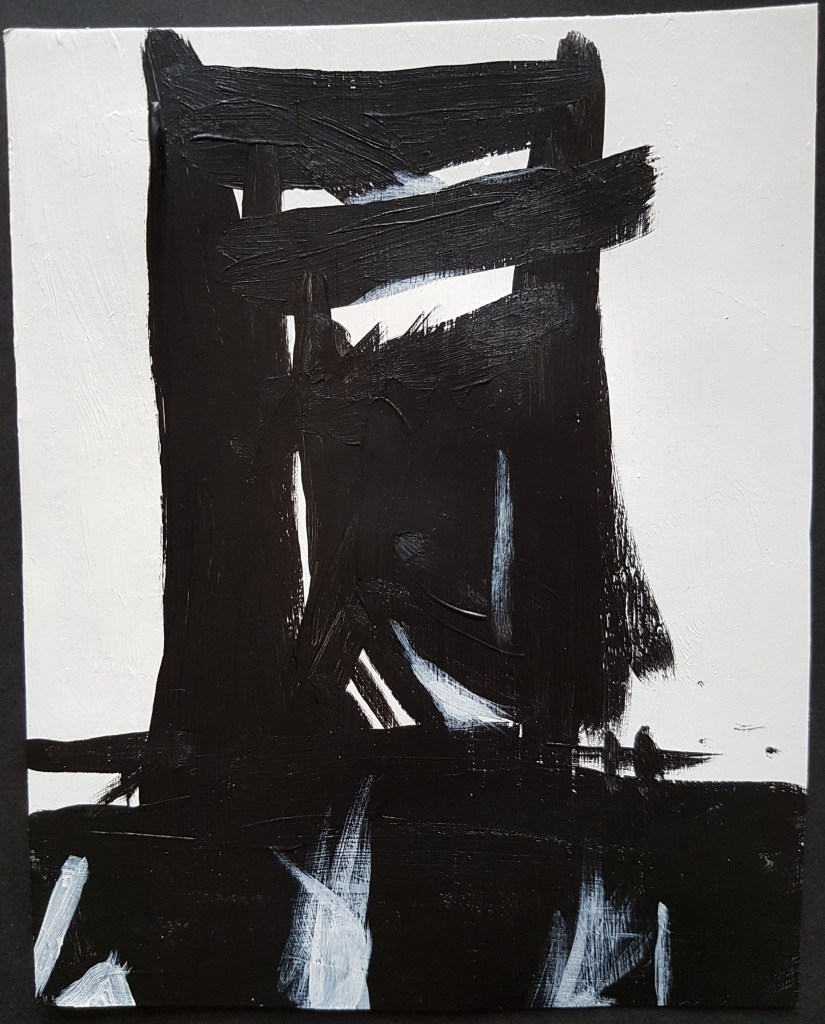
I drew the above copy of Franz Kline’s ‘Chief’ using an ink pen. I thought it would be interesting to draw this in ink because Kline’s paintings often started life as ink drawings. He would produce careful abstract studies in ink before he painted. Kline’s paintings seem so energetic and spontaneous that I find it hard to imagine that they started out as ink studies.
The use of ink to produce a copy of this painting has highlighted a very important element to Kline’s work, time. Using ink meant that the slightly different tones used in the painting had to be done by hatching and using lines to shade. This took time and created an overall more careful and deliberate looking piece. It looks more delicate (and somehow fragile) and the change in medium has taken some of the boldness out to piece. There is less evidence of movement in this copy than in the original and it lacks the grand, sweeping strokes that are key to Kline’s work. I think it almost looks cute.
I imagine that the ink studies that Kline would make before his paintings would have been smaller than this drawing and served a different purpose. They served as a plan before embarking on the larger painted version. This has shown me why Kline didn’t simply make a larger copy in ink of the original studies. As the texture of ink is runnier than paint it sinks into the paper more quickly and therefore it is much harder to push around or make quick gestures with. It also creates a flatter, smoother texture. You could not layer the ink.
This medium would have changed Kline’s bold ‘action paintings’ into something more careful and less textured and therefore change the overall feel of them.
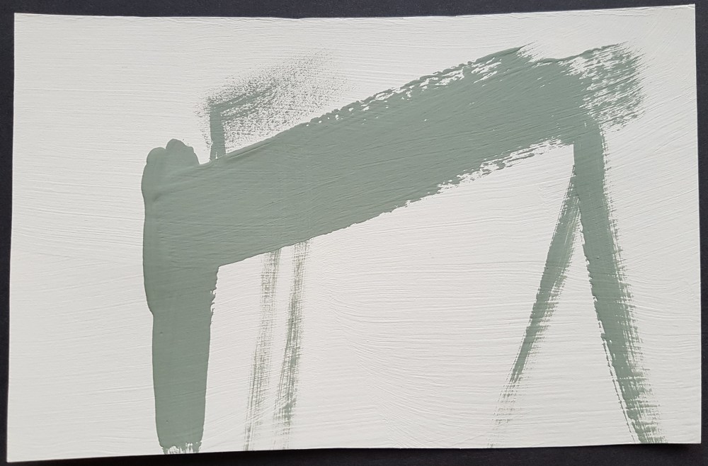
The above image is of a small reproduction of ‘Meryon’ in acrylic paint that I made. This copy is undoubtedly more like the original than my previous copy of ‘Chief’ due to use of a similar medium. Although I used paper not canvas as my starting point, acrylic has a similar thickness to house paint and therefore behaves in a fairly similar way.
The reproduction I have made is much smaller than the original and therefore, whilst I tried my best to create sweeping gestures, I could not use my whole arm and this made the process more careful and delicate especially as I was copying the image. However, I do feel that due to the use of a similar medium I was able to produce some of the movement from the original.
It becomes very apparent if you reproduce this work how calligraphic it is. When you create the main shape, you do feel like you are drawing a Japanese character.
I felt that an important element to get right was the use of white on top of black at the bottom of the painting and here I think I achieved a good representation of this part of the work. The white is important to create balance and a certain amount of depth.
Experimenting with house paint
As I have recently moved house I happen to have some tester pots of house paint and thought this might be an excellent opportunity to further understand Kline’s process. I therefore decided to produce my own paintings in house paint to see what it is like to work with and understand Kline’s attraction to it.
I did not use canvas as Kline would have and the pieces I produced are smaller due to limited space. I also did not produce the small ink studies that Kline usually started with. I understand that he would project these ink studies onto the wall to view them in their larger, abstracted state. Not having a means to do this I decided instead to draw from industrial images and shapes that inspire me.

I used the above image as a starting point. This is an image of Samson and Goliath, two ship building cranes that are iconic features of the Belfast skyline. These cranes were part of the Harland and Wolff shipyard which was a major employer in Belfast until it fell into financial hardship. These cranes have been preserved as an important part of Belfast’s history but I find it sad to see them unused, knowing that their lack of use caused many people to loose their jobs. They are, however, a symbol of a city I love and I have a huge fondness for them.
I created two paintings; the first can be seen above. The clay house paint that I had available is not as glossy as the paint that Kline would have used but it has been created for the same purpose (to apply to walls in vast quantity) so I was hopeful that it would behave the same. I also only had more earthy tones available than Kline would have normally chosen. I chose a very pale green/cream colour and a darker grassy green. I actually quite like the use of these colours as they give the paintings a weathered, aging look (like moss or lichen) but I wish I had more contrasting colours to use.
The above image is of just one of the cranes and involves just two layers of paint; the light green background and the crane painted in the darker green. I know that Kline painted white, then black, then white, then black but I made a judgment call with this painting. After I had painted the dark green image I felt that the image looked how I wanted it to and no more layers were needed.
I can see why house paint would be an appropriate paint for Kline to use as it is easy to apply in vast quantities due to the texture and you can work quickly with it. The first coat (the light green coat) created a textured surface and this influenced some of the brush strokes on the second layer, encouraging me to carry my strokes on after the main bulk of the paint had been used to bring out that texture. The dark green strokes are inspired by the bulky structure of the crane. You can see this on the main, largest brush stroke at the top of the image. This brush stroke goes quickly from left to right and you can see how the brush stroke becomes more textured further towards the right as the brush looses its paint. I used the fact that I had less paint on the brush to create textures in the other lines as I liked how this abstracted things a little.
I chose to call the above painting ‘Wolff’ after the Harland and Wolff shipyard it sits in but also to evoke the powerful apex predator of the same name as I wanted to give a sense of the crane’s power. Titles were important to Kline so I thought it was important to give the title some proper thought.
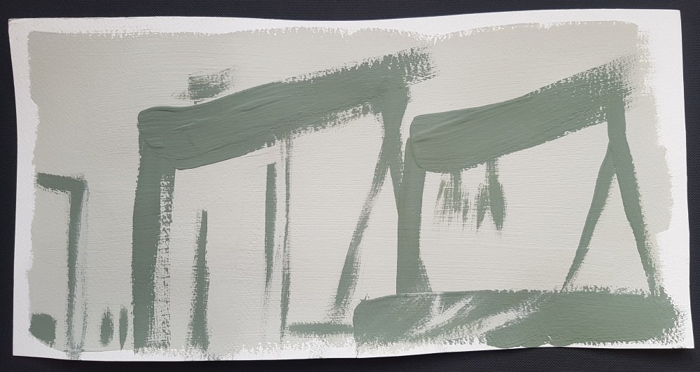
The above picture is of the second painting I created. This is inspired by the image of both cranes. This is a larger painting and I do feel like the technique I used here was probably more true to Kline’s. I was able to make more sweeping quick gestures due to the larger scale.
Another part of my technique for this painting that was more true to Kline’s was that I painted dark green on top of pale green, on top of dark green, on top of pale green. I think the painting really benefits from these layers, as it creates interesting textures and broken lines (see the vertical line in the centre of the left hand crane). I used ‘Meryon’ by Kline as inspiration for some of this layering; for example the pale green splashes of paint at the bottom right that look a little like water. This is also a reference to the nautical history of these cranes.
When painting the bottom layer of paint I did not paint to the edge of this page; I’m not actually sure why. I think it’s because I enjoyed the textures that the pale green paint made at the edges and so did not want to paint over it.
I decided to call this work ‘Giants’ as these monstrous cranes tower over Belfast, reminding it of it’s ship building past.
Self Assessment
I feel that this was a worthwhile exercise and I understand Kline’s method a little better now and his reasons for using house paint. House paint not only lends itself to being applied in vast quantities quickly, with energetic strokes but it dries quickly too which means you are not waiting for layers to dry before applying more paint. This maintains the energy of the painting process.
I feel that this is a type of paint that you really couldn’t paint daintily with due to the texture of it and how fast it dries. This almost forces you into the bold, dynamic lines which lend themselves so well to industrial shapes.
I am pleased with how both my house paint paintings turned out but I slightly prefer ‘Wolff’. There is something in the simplicity of this painting and I like the textured lines. I do however wish that I’d have had darker paint available as this would have created greater contrast.
It has been valuable and interesting to observe how much difference using pen made in my reproduction of ‘Chief’. The lines produced were much more careful than those I produced by paint, you just couldn’t make those sweeping gestures with the ink pen. The action of the ink sinking into the paper and drying quickly is largely the reason for this. It is worth therefore taking note of how the time your medium takes to dry effects your finished work.
